Brief History
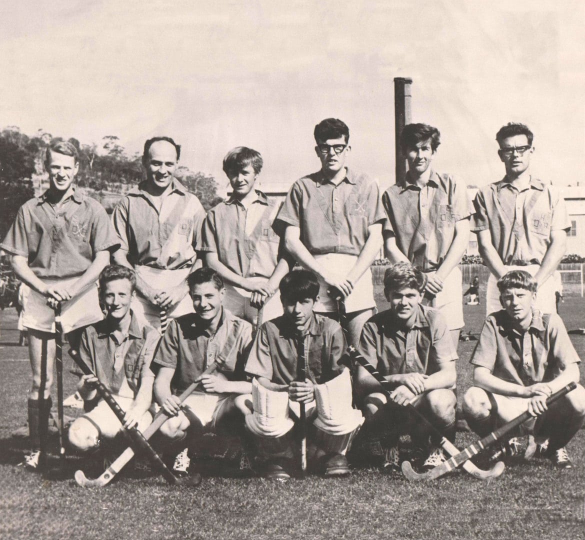
OHA Hockey Club takes its name from Old Hobartians Association – derived from the Hobart High School which was in Letitia St. (later Hobart Matric & now a funeral home). The OHA Hockey Club started in 1919. We are proud to have supported 9 Australian Hockey Representatives. Partially as a result of this history, OHA is a highly successful club both on and off the field. OHA is proud to be the largest hockey club in Tasmania with 28 senior and junior teams. Off the field, OHA is known for its club spirit, mateship and loyalty. Our club has a strong volunteer committee, which oversee the administration and management of club issues and finances. Our junior development program and academy is acknowledged as one of the leading within the state.
Centenary Logo - The Design
We have had around ten different logo designs over our 100-year history. The current logo being in place from approximately the mid-late 90’s.
The design process began with the President tasking the Centenary Sub-Committee with looking at the logo and updating it for the 100th year. The sub-committee discussed and debated the individual elements of the logo including its history and through our club in-kind sponsor and graphic designers, Plants Management Australia, a number of alternatives were created. This committee includes a number of life members and people with a deep connection to the club. The final design was presented to the General Committee and approved for use for our centenary year.
The stylised ship is maintained as the central feature as has been the case since the first design of the original logo of Hobart High all the way back to 2019. It has also taken centre stage of our previous logos, although it has been in different shapes and sizes over the years
The Latin translation of the Hobart High motto stands for: Always moving forward honestly. This is why the ship has it sails up and is therefore only able to move forward.
The waves beneath the ship represent the movement and forward motion of the ship and the ever-evolving club on and off the field.
The somewhat nautical circle around the logo enables the clubs name to be incorporated along with the new 100-year Slogan: 100 Years Strong. This also represents the motto of always moving forward in a never-ending motion by way of the arrows.
The slogan 100 years strong was drawn from our members and supporters with a number of submissions going into our centenary year slogan & taglines being: 100 Years Strong & Celebrating our Past and Inspiring Our Future.
Thank you to our committees for the design and approvals process and Chris Sargent & his team at PMA for the design work.
I commend this logo and slogan to you and look forward to celebrating our 100th year in 2019 with you,
David McCambridge
President


